Beta life
My plan at first was to resist the urge to install any of the betas that came out of WWDC this year. I thought to myself that I do so every year and while it’s fun. I should try to do something different this time around. To embrace the stable iOS and macOS operating systems that I use everyday on my main devices. I don’t have any test devices or spare Macs just one iPhone and one Mac.
But as the betas kept coming out I was more and more curious. The iOS Lock Screen seemed really awesome and I wanted to try it. On the Mac I was really interested to try Stage Manager and see how it worked. Then the other big temptation was the Xcode betas and new SwiftUI API’s.
When working on my side project there were lots of SwiftUI API’s I wanted to try. It’s one thing to run them in a simulator but I wanted to build and run them on my Mac and iPhone to really test them out. When beta 3 came out I finally went all in and installed the iOS 16 beta and macOS Ventura on my only Mac and iPhone.
Having lived with the betas now I am very happy I made the jump. The macOS beta was a little more scary because the last time I ran a macOS beta it was Catalina and my MacBook Pro did not have a good time with that. But with Apple silicon things are different now. My Mac and iPhone work really well with the betas and while its still a beta this years seem pretty good.
iOS 16
Living with the betas is different and it’s reminded me how important it is to do so being a developer. I need to see how the new features change my day to day workflows and activities. Reading from an outline of new features is not the same as using it daily. So here are a few features of iOS 16 that jump out at me.
One of the things I really love is the new haptic keyboard. While this is off by default I feel like my phone is way more responsive reacting to every character I type. This may be the mechanical keyboard fan in me but it really jumped out as a big change.
The iOS 16 Lock Screen and wallpaper settings have changed a lot. The new Lock Screen hasn’t changed on iOS basically since its debut. With the new “widgets” i.e. complications, time fonts, and wallpaper collections things are very different.
Wallpapers come in pairs now to an extent. The system really wants you to set both your Lock Screen and Home Screen wallpaper together. This has really broken my previous workflows because while I change my Home Screen wallpaper somewhat often I don’t do the same for my Lock Screen. It’s kind of a hard process to wrap my head around. Before I would just use a photo in my photo library bring up the share sheet and set it as my Home Screen wallpaper. I could pinch and zoom easily and set it quickly. iOS gave you the option to set the photo to both the Lock Screen or Home Screen or just one of those.
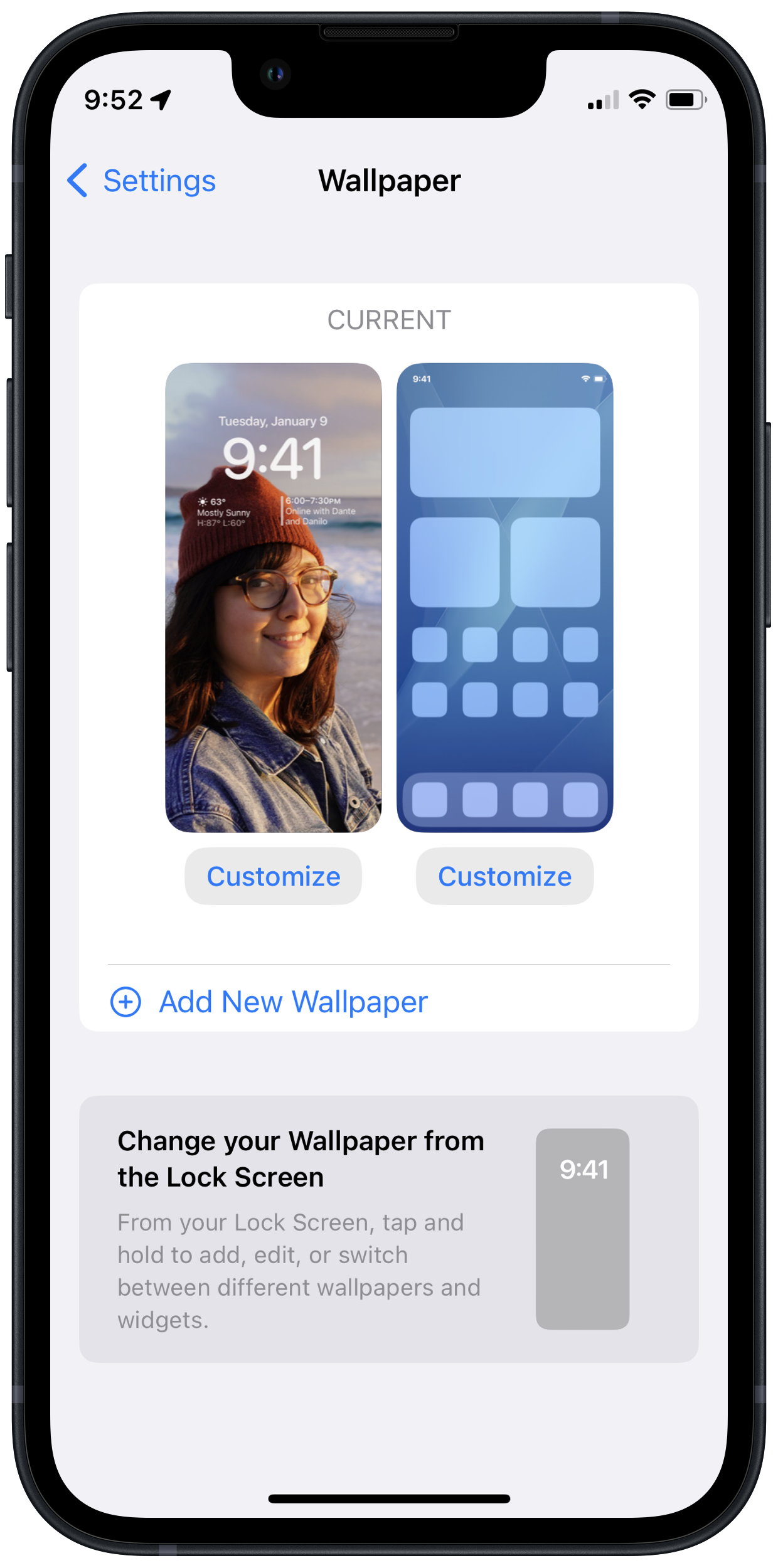
With iOS 16 I need to change this workflow. By far the easiest way to set one wallpaper is to do so with the settings app in the wallpaper screen. It presents each wallpaper and lets you set them individually. Setting your wallpaper in the photos app now is kind of crazy. Im not sure how many people set their wallpapers using the photos app or the settings app. But if a majority use the photos app I think theres gonna be lots of confusion and frustration. Again this is a beta and things can change but as in beta 3 here is the process while using the photos app.
Like before when looking at the photo you tap on the share sheet and choose set as wallpaper. Then it gives you two options to set as a wallpaper pair or customize Home Screen. But these options are misleading because no matter what options Ive picked setting your wallpaper this way always creates a wallpaper pair. I think it’s because of how iOS now lets you have multiple lock screens almost like watch faces. These can all be tied to focus modes and gives you more control that way too. But I expect the vast majority of people don’t use focus modes and this whole process gets more complicated.
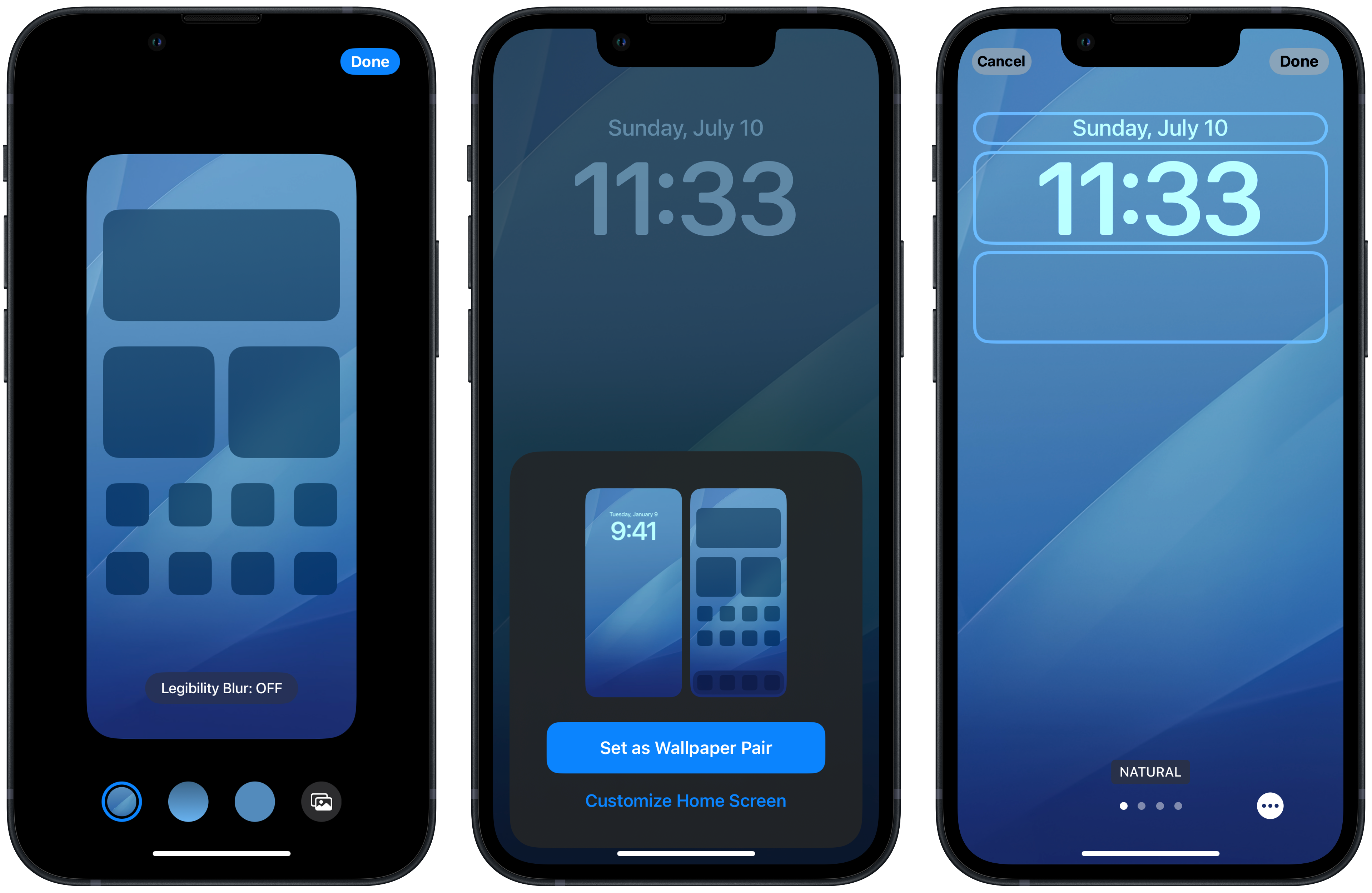
I really hope they find a simpler better way of doing this before it’s released. Before it was so simple to just have the photos app open find a photo and set it as either your Lock Screen or Home Screen wallpaper or both. Now its both option is basically the default.
I do like the new way the lock screens look and I love how you can have one photo take the main stage on it. Having your now playing screen and notifications on the bottom feel way better. But all of these other changes for setting wallpapers need to be updated so it’s easier. Wallpaper pairs can be cool but it should be way easier to set just the Lock Screen or Home Screen if thats all you want.
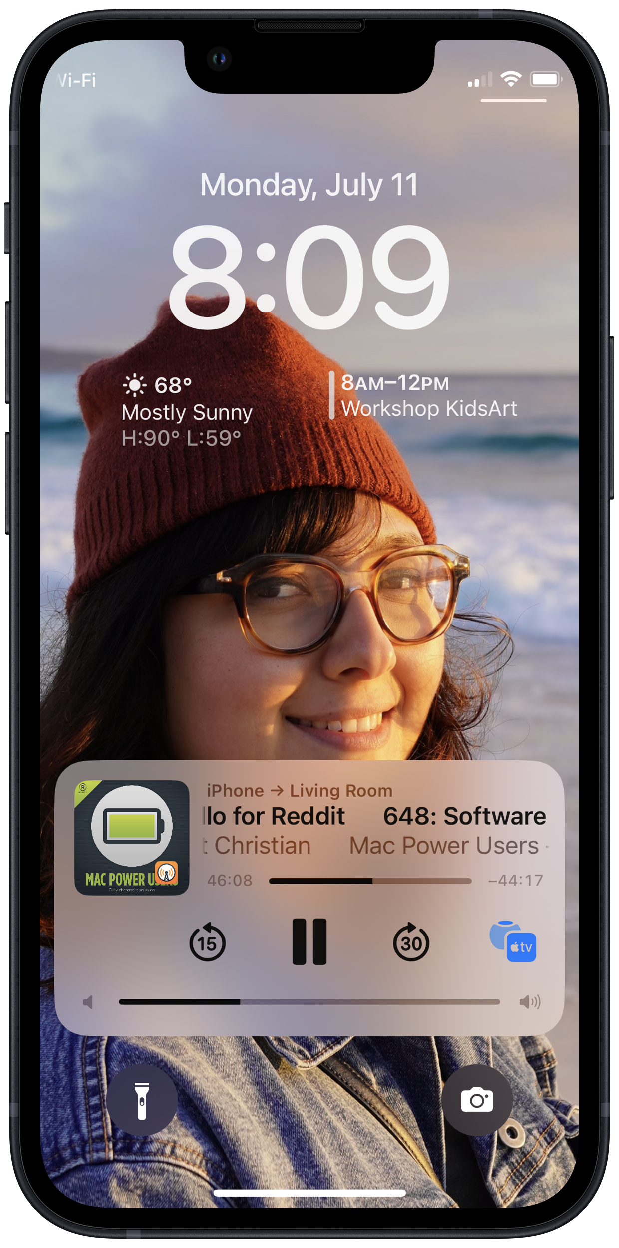
Another thing I have noticed first on the now playing screen is the new media controls. If I am listening to a podcast or music iOS now shows the volume without a circle to easily swipe and change the volume. There is just lines that you have to tap on and drag which work the same way but I miss this visual cue. This almost feels like the Touch Bar UI coming to iPhones which is really strange. I don’t really think this helps usability and it doesn’t really look any better either.
One last small change I do like is the new search button on the Home Screen. Often times when I’m using my iPhone my brain always things its the easiest way to find an app is by swiping down and seeing the Siri suggestions or searching for it. Having this one tap away now is something I really like. It’s funny I was just talking about a visual cue that went a way making things harder and now I’m enjoying one that was added. I hope Apple sees that having more useful UI on screen is a good thing and not a bad thing.
macOS Ventura
macOS is very mature now and there isn’t many things Apple adds to it year to year. But this time there was one feature I couldn’t wait to try. Stage Manager feels like it was meant for my brain. I love Stage Manger and I almost have it enabled full time when using my Mac. Maybe it’s because I am a fan of Spaces but this new window management system is excellent. I really enjoy focusing on one app at a time or a small handful. Again having that visual cue on the side of other apps you’re using is a really nice touch. If my Mac didn’t have this feature I would go so far as to say it would feel broken. It’s that important to me now. I feel more focused and in control when Stage Manager is on.
Beta Life
All in all beta life has been going well. I am looking forward to see how these features and more will evolve ahead of the full release this fall. On the development side I am really glad to have waited till now to dive into SwiftUI. The recent changes for navigation and introduction of NavigationSplitView are something I have been waiting for. Now that they’re here I want to try and build a multi platform app with it. I’ll try to post about that when the time comes but for now it’s time to learn and put in the time with Xcode. What do you think of the betas? Let me know.